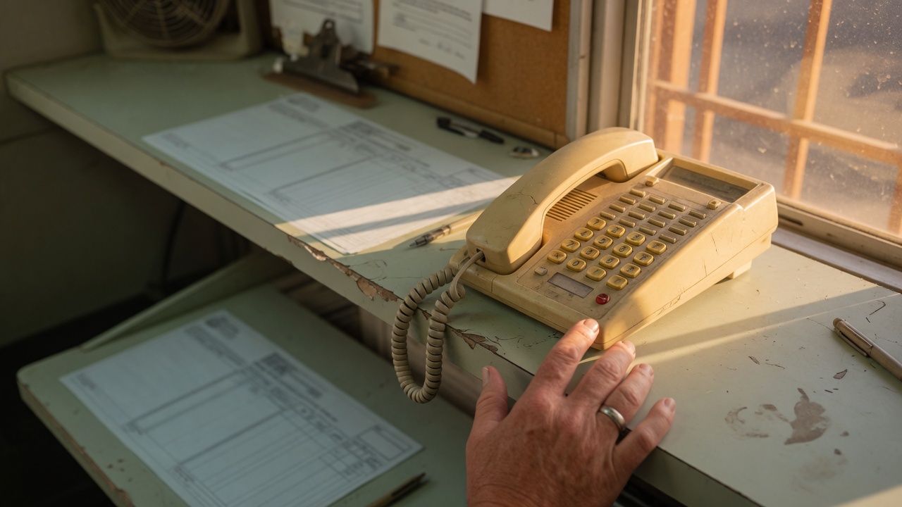
Put click-to-call above the long contact form
A homeowner standing in a hot hallway is not going to type ten fields. They are going to tap a phone number. If that number sits under a long contact form, the call goes to the shop that put the number on the first screen. Ethical AI is in Frisco, Texas. This is how a trades company puts click-to-call above the form, and keeps the form for the people who actually want a written estimate.
The job is decided on a phone
HVAC, plumbing, electrical, pest, and roof calls start the same way. Something in the house failed. The owner searches the city, opens two or three sites, and taps the first number they can see without pinching the screen. They do not compare essays. They do not finish a form "just to see." The shop that answers gets the job, or at least the chance to book it.
A desktop preview hides this. On a wide monitor the phone number can sit in a corner and still look present. On a phone, that corner is a thumb-width of gray text under a banner, a chat bubble, and a form that asks for a preferred time before it asks for nothing else. If the dialer does not open in one tap, you do not have click-to-call. You have a picture of a phone.
What belongs on the first screen
Three facts, in this order, before any form field:
- The public name, the same one on the truck, the invoice, and the listing.
- One city. The city you actually roll trucks from. Not a list of twenty towns.
- The shop phone, as a real link, large enough to tap with a thumb, repeating the digits so a person can read them too.
The link uses the telephone format so the phone opens the dialer. The digits on the screen match the digits in the link. A button that says Call and then opens a form is not click-to-call. A button that says Call and dials a different number than the one painted on the truck is a second company.
Put that block in the header, and put it again immediately above the form. Headers collapse on small screens. The second placement is the one that saves the visit when someone has already scrolled to "contact."
What the long form costs
Count the fields on the contact page as a customer would, on a phone, with one hand. Name. Email. Phone. Street. City. Service type. Preferred day. Preferred window. How they heard about you. A message box. A checkbox for updates. A captcha. That is a desk task. It is a reasonable way to ask for a written estimate from someone at a kitchen table. It is a bad way to catch a no-cool call at 4pm.
Each extra field is a place to leave. Email is the one people skip when they only wanted a person to answer. "How did you hear about us" is a report for you, not a help to them. A required message of fifty characters makes a leaking water heater wait on a paragraph. If the form is the only way to reach you, you have told the hurried caller to call someone else.
You can keep every field you truly need. You cannot put them above the phone, and you cannot make the phone appear only after the form is submitted. Submission is not a conversation. A ring is.
Phone first, form second
Move the form down the page. Label it so it tells the truth: "Request a written estimate." Leave it for the customer who is comparing two quotes on a Saturday morning and wants the numbers in writing. Do not label it "Contact us" if the real contact is the phone. People follow the label.
The form that stays should be short. Name, a callback number, the city, and what is wrong. Four lines. A person calls them back the same day, during the hours you publish. If you are closed, the page should say when a person will call, in the same voice as the listing. A form that promises "we will be right there" at 10pm, when nobody is on call, is the same problem as a badge you have not earned.
Do not hide the phone behind "send this form and we will text you a link." That is a second wait. The customer already has a phone in their hand. Let them use it.
One number, everywhere
The number in the header, the number above the form, the number on the truck, the number on the invoice, and the number on the listing are the same number. A website-only line looks local and then dumps into a queue that does not know the job. The customer hears a different greeting than the name they just read. They hang up.
If a call-tracking line is not the number you answer as the shop, do not make it the only tap on the page. Tracking is allowed when a person still answers with the public name and the listing shows the number people actually dial. A second secret number "just for the site" splits the shop in two. The name and the phone on the page have to match the invoice.
What not to stack on top of the phone
The first screen is not a billboard. A rotating set of offers, a financing banner, a chat window parked on the button, and a "download the app" bar all compete with the tap. Pick one offer if you need an offer at all, and put it after the phone, not over it. One offer on the homepage is the same rule from the other side: the phone and the city stay readable.
Do not cover the number with a sticky bar that only appears after a delay. Do not make the number the same color as the background. Do not render it as an image of digits. An image of a phone number cannot be tapped, and a screen reader cannot read it. Real text, real link.
Check it the way a customer does
Turn off the desktop. Open the live page on your own phone, on the cell network, not the office Wi-Fi preview. Count the taps from the moment the page loads to a dialer with the right digits filled in. The honest count is one. If you must scroll past a form, a map, and a paragraph about your founding year before the number appears, the order is wrong. Move the number up and check again.
Then call it. The person who answers should say the public name before they ask for the address. If a recording answers with a different company, or the call lands in a general inbox nobody watches after lunch, the button is advertising a promise the shop does not keep. Fix the answer before you restyle the button.
Ask one tech and one office person to do the same check without you watching. If they cannot find the number in five seconds, a stranger will not either.
Tonight
- Put the public name, one city, and the shop phone above the form.
- Make the phone a real tap, with the same digits as the listing and the invoice.
- Rename the form to a written estimate, and cut it to four fields.
- Open the page on a phone and call the number you see.
- Remove anything that covers that tap.
Need the first screen to match the way the shop actually answers? Start at get started. Phone first, form second. Ethical AI · Frisco, TX · 469-669-2728.